Skip to content

Booking journey and wellness app UX/UI

Bluecrest

Overview

Bluecrest wanted to get a fresh perspective on their customer experience and engaged my agency to provide a full audit of their customer journey. This included a CX mapping exercise, marketing website audit and booking journey review which led to over 100 recommendations for improvements across the full journey.

The company asked us to tackle 2 critical areas first – the booking journey where customers were dropping off at an alarming rate and the my wellness app where customers receive their all important blood screening results.
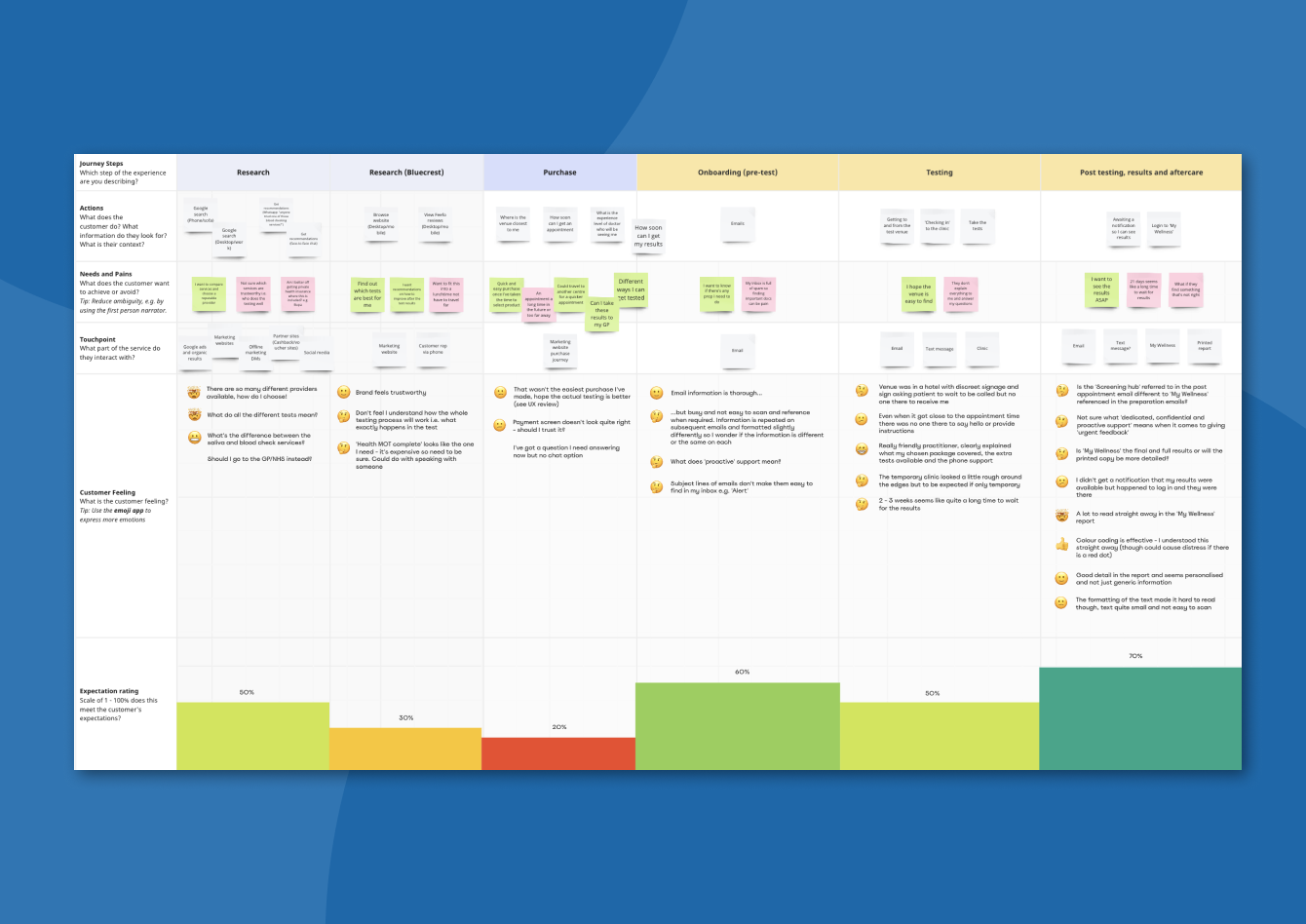
  • CX map
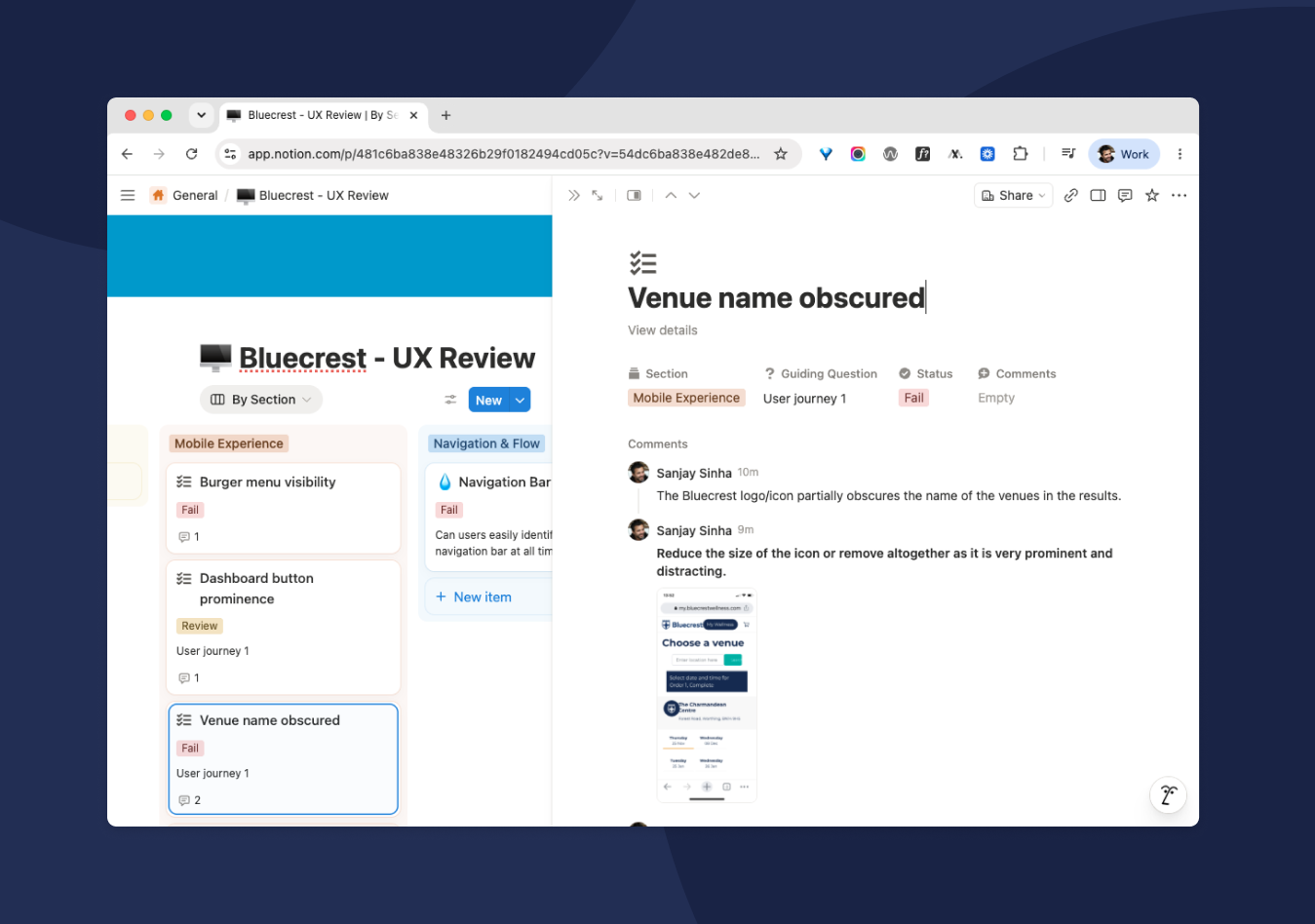
  • UX audit
  • User flow
  • Workshop

Approach

Undertaking the full customer experience entailed researching screening providers, booking the test, going to the testing centre and providing the sample and then receiving the results and the follow-up. It gave me a first hand insight into exactly how a typical customer engages with Bluecrest’s services and allowed me to map the experience highlighting issues and opportunities for improvements.

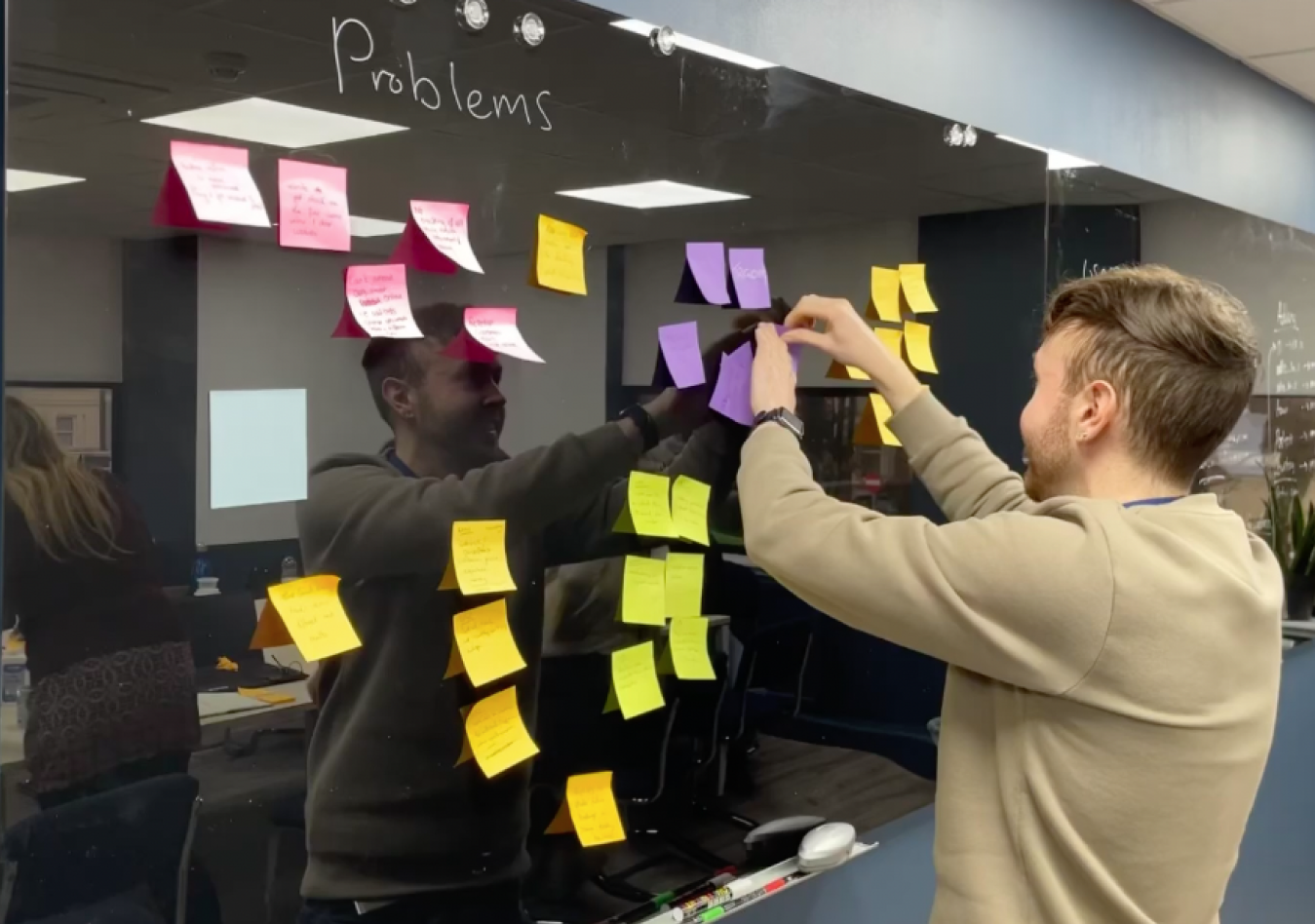
This was followed by a full UX audit of the marketing website and one of the most useful exercises was workshopping the key problem areas for the business such as legacy infrastructure, time spent on customer service requests and customer retention – getting the key stakeholder view was essential to prioritising updates particularly to the my wellness application.

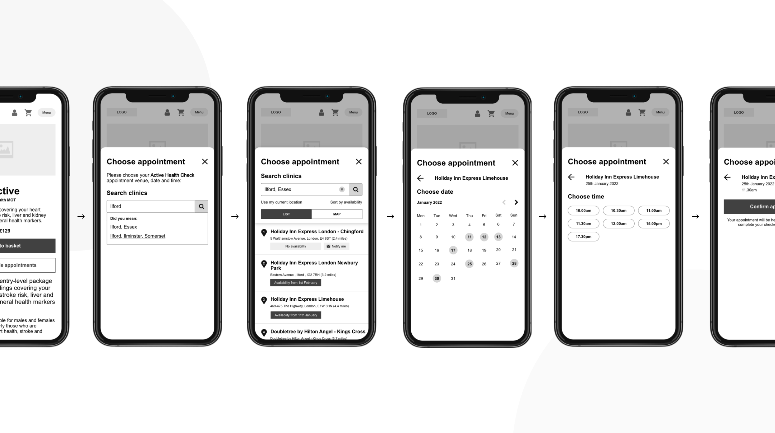
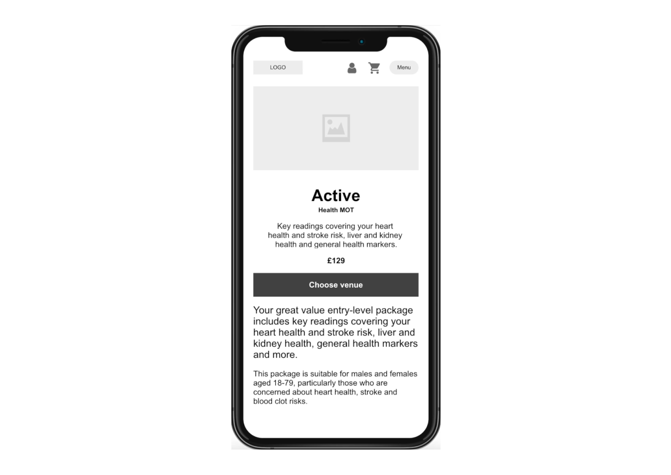
Booking journey wireframes
  • User testing
  • Wireframe video

Booking journey UX

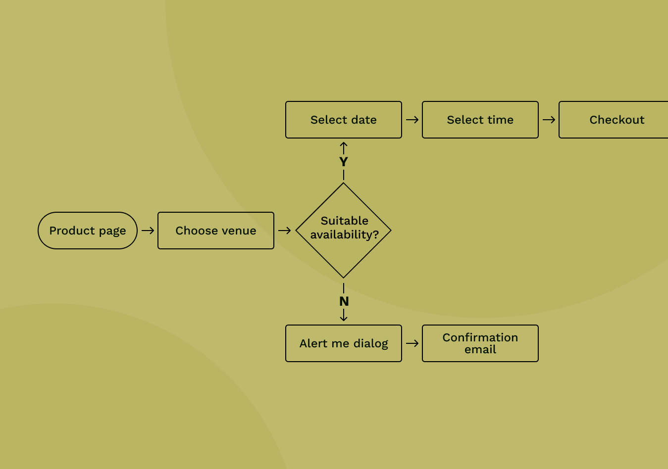
A key part of the customer journey is the appointment booking process where customers’ choose a venue, date and time for where they have their blood sample taken along with other key biometric data. There was a large drop-off rate during the venue selection screens and the process was too long given the number of actions the user had to take.

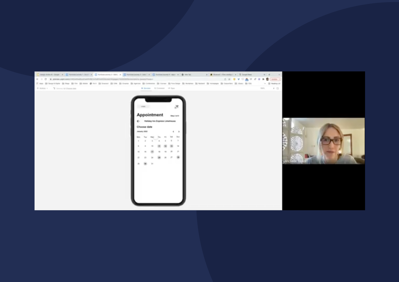
Through user journey mapping to explore shorter user flows and quickly wireframe prototyping the options we tested with the team to determine which UX would be developed by the internal development team.

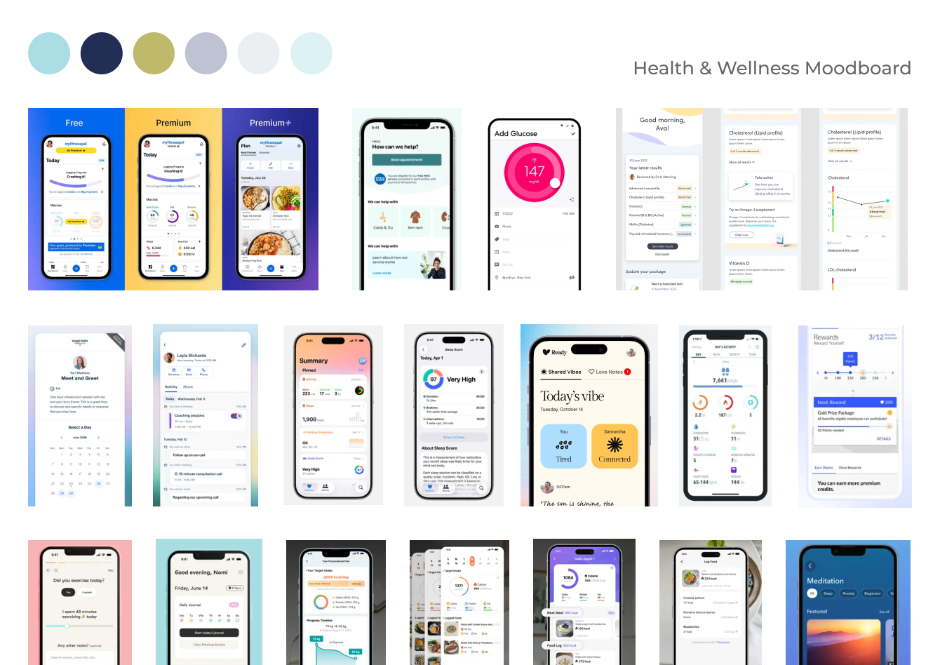
  • Moodboard
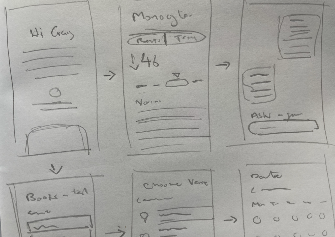
  • Sketches
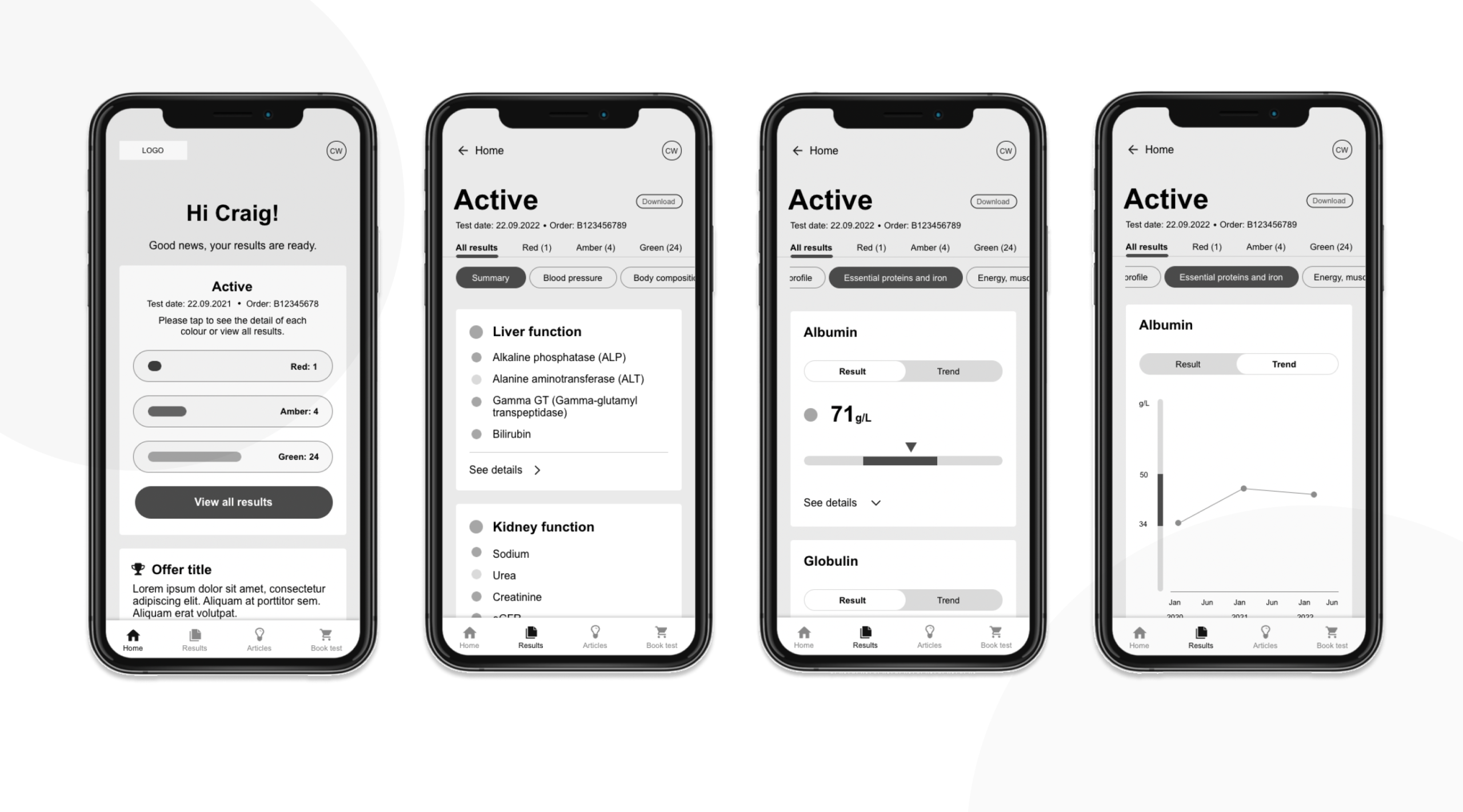
App wireframes
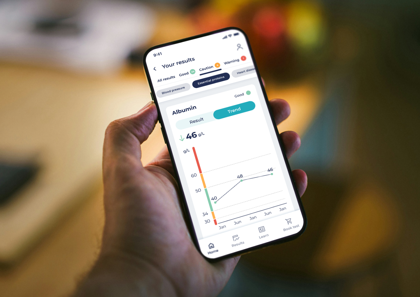
  • App in hand
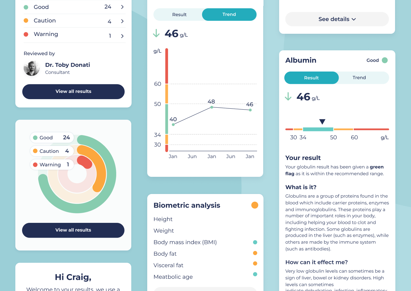
  • App UI
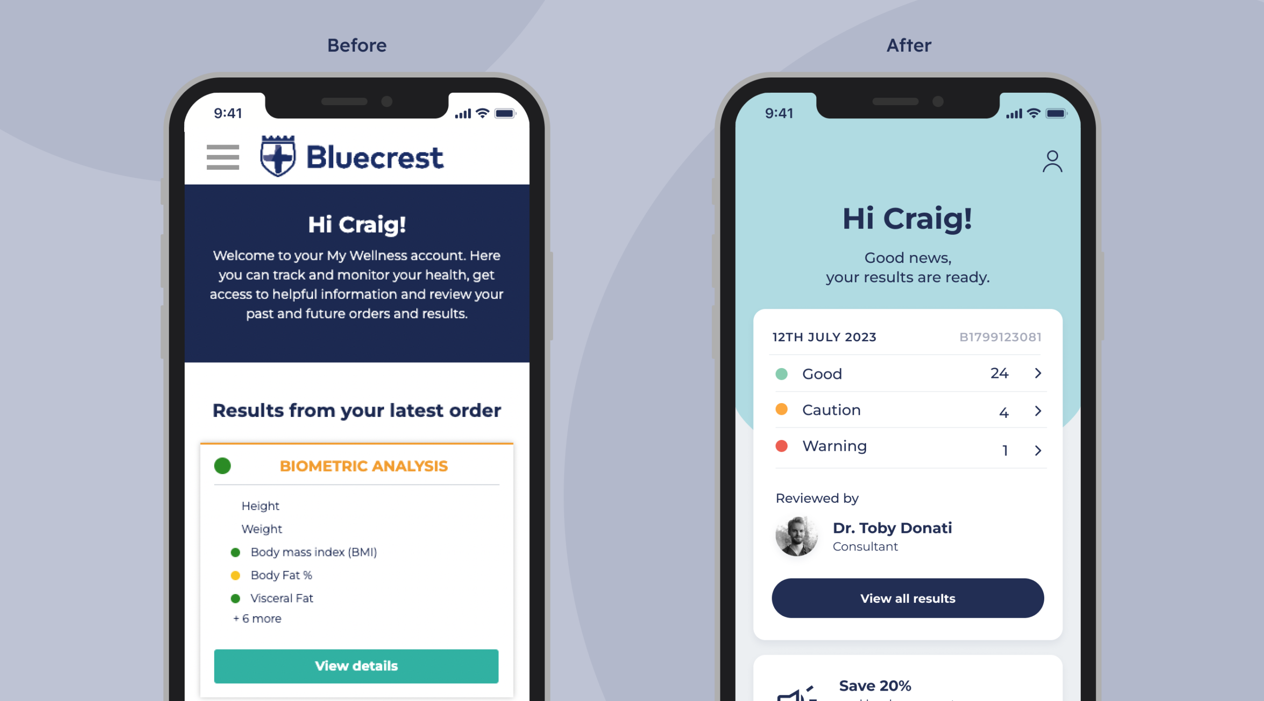
Before and after
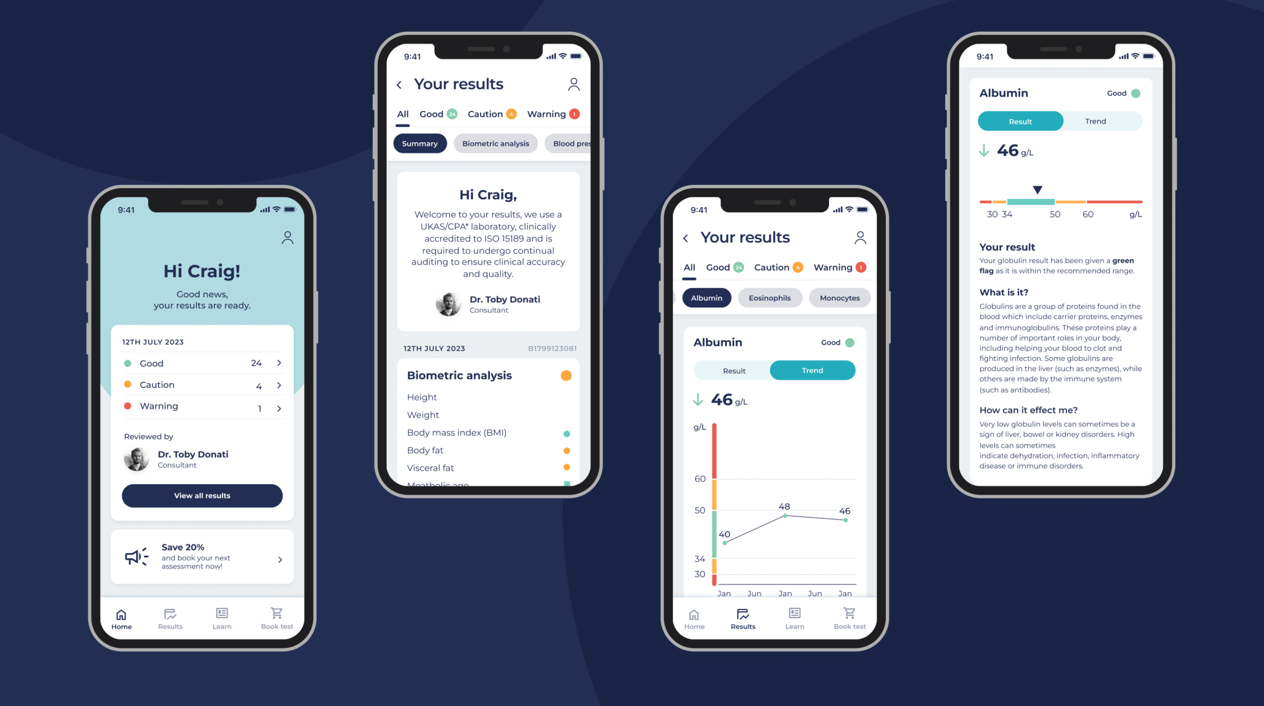
App screens

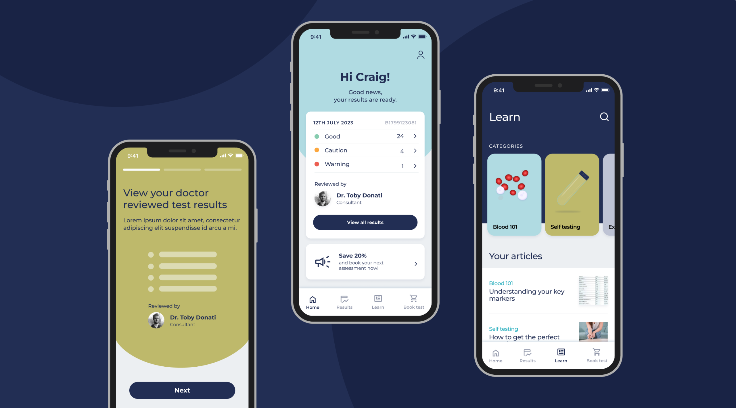
My wellness app

Receiving the blood screening results is the most critical part for the customer – excitement, trepidation or apprehension are all emotions they might experience so designing a calm, inclusive and above all easy to use and understand results experience was crucial for its success.

We need to present up to 200 blood readings with technical language and give the user help to understand both their overall summarised health position as well as information for deeper dive all in an easy to consume format. As well as giving the business opportunities to promote offers and complimentary services.

Again sketching and wireframing to explore options was really key – testing before spending the time developing the hi-fidelity design system which saved time overall before moving into hi-fidelity design.