The free typefaces that saved my designs
Posted February 19th, 2014 in Typography
Copyright is still a huge issue when it comes to how and what we publish online.
Thankfully though, as the digital medium matures, rewarding the hard work of others when using their intellectual property is becoming a much more straightforward process. Organisations of all sizes are now much more alive to the need for having all their digital assets be it design, code, imagery or type correctly licensed.
Of course this is a good thing but it does sometimes cause problems when the cost of a particular asset, in this case a typeface, falls outside the budget of a project.
I’ve encountered this problem several times over the last few years – having included a relatively expensive typeface in a mockup and getting client sign off – only for it then to be vetoed after the actual usage costs have been established.
You don’t want to disappoint the client and you don’t really want to compromise on the style of type you’ve chosen. So what’s the solution?
Fortunately the design community has come to the rescue and below are 5 fonts that are FREE and have saved my blushes over the last few years when the budget for a project doesn’t quite stretch to the all important typeface.
Museo Sans
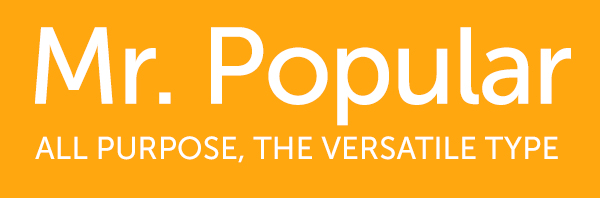
Arguably over used but for good reason – a versatile typeface that looks as good on a screen as it does in print. 2 weights are available for free and can be downloaded here.
Montserrat
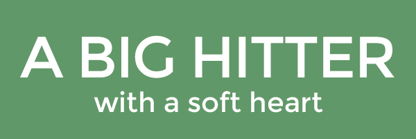
I recently included Gotham in a design without fully exploring what the usage costs would be for the entire company to have it installed on their machines as well as for it to be used on their website.
Luckily Montserrat was a more the acceptable free alternative. Heavier then Gotham but with a similar feel it’s certainly worth a look if you can’t stretch to its costly predecessor. Download it here.
Nevis
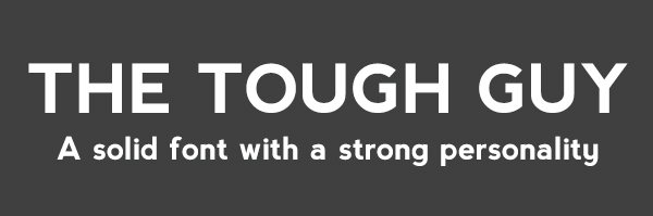
Again, I found this typeface whilst searching for Gotham alternatives – probably better used for titles or on buttons rather then body text – crisp and angular in caps and soft yet weighty in small letters it’s definitely a font to have in your type arsenal. You can grab the font here.
Lobster
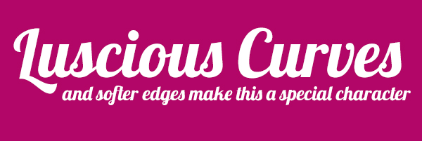
Script typefaces have been extremely popular for a while now almost to saturation levels particularly in logo design.
Fortunately a few kind souls in the design fraternity have produced some very good and free script typefaces and if you’re after something clean and chunky that works well in both upper and lowercase then Lobster is your man (or Crustacean..) Check it out here – lots of ligatures and alternates come with the package too.
Cassanet
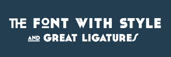
I love this typeface. I was putting together an invitation for a friend’s Great Gatsby themed birthday party and needed something suitable for the occasion.
I originally thought about drawing the main type then using something more generic for the rest of the invite until I discovered this Art Deco inspired typeface. Cassanet is available here for the price of a tweet or a voluntary donation.
The above are just a handful of the free fronts that are available online – take a look at this article from CreativeBloq for 95 other very good, useful and free typefaces.
NB: Whilst these typefaces are available for free there are still usually usage and/or distribution restrictions so please check the licenses before you use them.